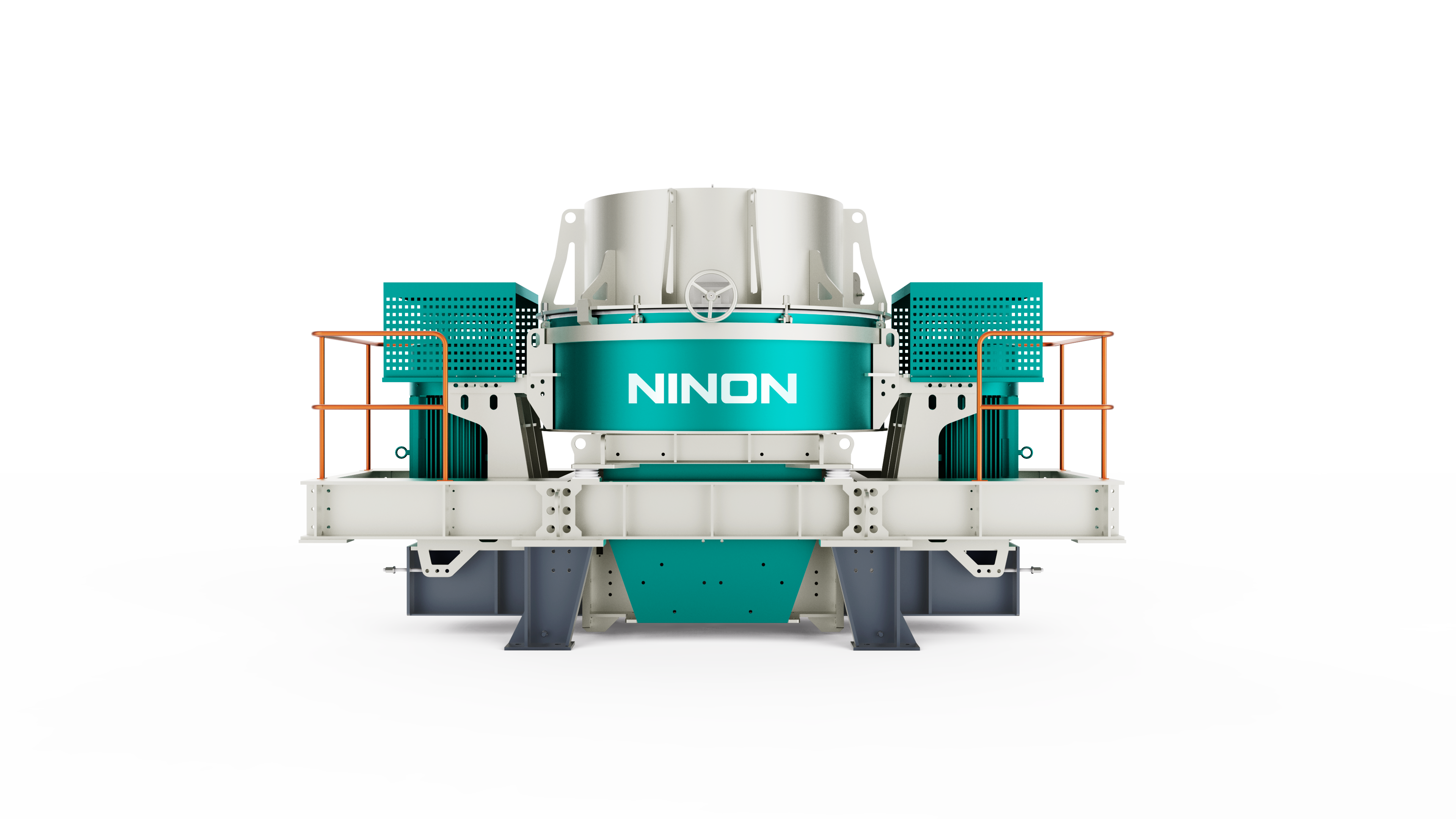
Ten Years of Journey to Set Sail Again Fujian Nonnon Technology Brand LOGO Rejuvenation Upgrade
Release Time:
2021-09-15
With the pace of progress, Fujian Nonnon Technology Co., Ltd. (referred to as: Nonnon Technology) has gone through ten years of spring and autumn. Nonnon Technology was established in 2013 (the factory was established in 2016) as aFocusIn [fine sand and gravel aggregate, non-metallic mineral materials, construction wasteCrushing, screening and mixingtechnical equipmentSpecialized new national high-techEnterprises, always continue to provide more intelligent and environmentally friendly technical equipment for the sand and gravel industry, continue to provide new solutions for the market, integrate industrial Internet and digital technology, enhance customer value and industry competitiveness, and jointly promote the low-carbon, environmental protection and high-quality development of non-metallic materials industry.
Make the material more valuable


Over the past ten years, as a supplier of green recycling new mineral material processing technology and equipment, Green Energy Technology has always adhered to the same dream and the same original intention, advancing in exploration, developing in innovation, and growing in change. With the accelerated development in recent years, the brand influence of Green Energy Technology is expanding day by day. Based on this change and the needs of future development strategy, Green Energy Technology announced the iterative upgrade of the brand, integrated the brand-new industrial design, launched the brand-new logo and VI, and opened the prelude to the strategic upgrade of the brand image!


As the most important visual carrier of enterprise brand, let's take a look at the story behind the new brand LOGO design of green energy technology.
1. Font structure
In order to continue the recognition of the company's original LOGO and improve the recognition degree, the new LOGO has been adjusted and designed on the original basis. The upgraded LOGO is generally vigorous and correct, representing the stable and atmospheric corporate image of Green Energy Technology, and is more in line with the current mainstream aesthetics. The font structure uses a wide stroke design, which is more vigorous and correct, making the logo of Green Energy Technology more standardized and standardized, and more beautiful and harmonious when presented as a whole.

2. Creative Ideas
a. Sense of responsibility and cultural confidence
Logo is derived from the surname "Wang" of the founder of Green Energy. It is the deep binding between the brand and the founder. Using its surname as the basic form of the brand logo is the expression of its confidence and responsibility for the brand, and it is also a commitment to customers and consumers.
Before "Wang" was used as a surname in traditional culture, it was originally a symbol of power, status and strength. The oracle bone inscriptions of Wang character are in the form of axe-tomahawk, and axe-tomahawk is a ritual vessel, symbolizing the sacredness of the king, so as to convey the extreme pursuit of the green energy brand for product quality. At the same time, the use of traditional Chinese characters as the basic form of logo also conveys the national confidence and cultural confidence of the green energy brand.

B. Equipment running status
The core component of Green Energy's main product equipment is in a state of high-speed rotation when it is running. The logo uses its dynamic silhouette fragments for geometric abstraction.

c. Circular and sustainable
Logo presents a rotating and circular situation, conveying the concept of sustainable, endless and environmental protection of the green energy brand, conforming to the development of the times and policy guidance, and highlighting the brand's sense of social responsibility.

d. Extend the open embrace posture
The two ends and four corners of the Logo extend outward, showing an extended and open embrace as a whole, in order to convey the attitude and concept of the green energy brand, which is inclusive and embraces the future.

3. Brand standard color
Emerald gems are formed in rock layers that are often stressed and extruded. Their colors convey tenacity, harmony and nature. Among many colors, we finally chose stone green, which is harmoniously changed on the basis of emerald, as the main color of LOGO.

4. Application Scenarios

The new face has changed, the original intention has not changed, the upgraded green energy technology, the confidence, patience, and determination to serve customers remain unchanged, the sense of responsibility and mission to the industry remains unchanged, and the persistence and inheritance of high-quality services remain unchanged.
Brand new upgrade VI, we hope to work with you to witness the transformation brought about by the upgrade and look forward to the new future of green energy technology.
In the future, please continue to take care ~
We have been on the road, never stop, with you, create a better future!
Related News
undefined
Tik Tok


Fujian Ninon Technology Co., Ltd.
Service Hotline:4006655896
Tel:0595-22557155、13808548004
Email:nonnon@fjlnkj.com
Website:http://www.fjlnkj.com/
Factory Address: Hardware and Electromechanical Industrial Park, Luojiang Economic Development Zone, Quanzhou City, Fujian Province (No. 268, Luobin North Road)
Page Copyright © 2022 Fujian Ninon Technology Co., Ltd.

